This article has been reviewed according to Science X's editorial process and policies. Editors have highlighted the following attributes while ensuring the content's credibility:
fact-checked
proofread
Scientists create high-resolution poverty maps using big data

A team of researchers from the Complexity Science Hub (CSH) and Central European University (CEU) created more-detailed poverty maps using computational tools that bring together survey information, and data and images provided by public sources such as Google and Meta (Facebook).
The poverty maps for Sierra Leone and Uganda, two Sub-Saharan African countries with extreme poverty, will be presented early May at the Web Conference 2023 in Texas, US.
For years, policymakers, planners, and researchers have relied on surveys and census data to track and respond to poverty. "Gathering this information, however, can be time-consuming and expensive," explains research fellow Lisette Espín-Noboa, a postdoc at CSH and CEU and first author of the study. "And a census may not include hard-to-reach areas."
"If you ask why we need high-resolution poverty maps, the answer is simple. These incredibly detailed poverty maps can identify places in need that otherwise wouldn't be captured in maps using only census data," adds CEU associate professor Márton Karsai, co-author of the study.
"In regions with a lack of direct information, it is challenging to estimate the socio-economic status of people. In our study we focused on two countries, Uganda and Sierra Leone, where high-resolution, large-scale estimates are not available," points out professor János Kertész, head of the Department of Network and Data Science at CEU and co-author of the study.
Datasets
In the first step, the team gathered demographic data from two surveys. "In particular, we focused on the housing characteristics questionnaire. This helps estimate household wealth by considering the quality and quantity of available facilities or assets at home," say the researchers.
For both countries, International Wealth Index (IWI) scores were calculated. IWI indicates how well a home possesses a basic set of assets. The lower the value, the lower the quality of housing. And the higher the value, the wealthier the household.
Second, Espín-Noboa and colleagues compiled a second dataset of satellite imagery and geographic information system data provided by crowdsourcing and social media sources, like Google and Meta (Facebook).
Over 900 features were extracted that offer insight into the economic status of the population, the infrastructure development of the area, and other wealth indicators. "This data shows, for instance, how many antennas are located in a certain area, or the number of people visiting the same area. It can also indicate how many Facebook users own an iPhone," explains Espín-Noboa.
Models
The team created three machine learning models that were trained to determine not only a place's average wealth, but also its standard deviation. Ultimately, the goal is to provide a more accurate picture of the wealth distribution within each populated area. "We wanted to know how wealth varied within an area, or if there was inequality," points out Espín-Noboa.
The models were trained to learn correlations between the demographic data and IWI scores and the features extracted from data and images provided by public sources. "They learn, for instance, that a specific wealth value correlates to a specific set of features," says Espín-Noboa. "Next, we tested the models by asking them to predict the wealth of different areas."
The team developed three models: one based on satellite imagery; a second on crowdsourcing and social media data; and a third on combining the two. "We wanted to determine which features contributed most to wealth prediction," explained Karsai.
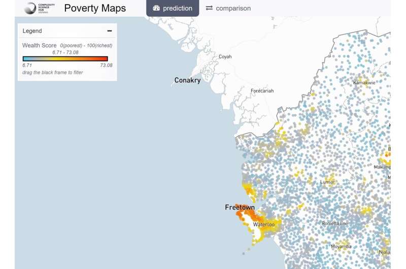
Using the models, the researchers created maps detailing the poverty levels of communities in Sierra Leone and Uganda. They also created an interactive map tool where users can compare wealth inferred in both countries and explore the machine learning models.
"The performance of our models is comparable to the state-of-the-art and, in some cases, outperforms it," ponders Karsai. "Importantly, we estimate not only the economic status of people living at a given location but also local fluctuations. Moreover, we find that different methods are needed for estimating high income (where satellite images provide good results) and poor regions (where metadata-based methods are the best)."
COVID-19 pandemic
For three decades, the World Bank has documented a decline in the number of people living in extreme poverty, defined as living on less than $2.15 a day. This trend was disrupted by the COVID-19 pandemic in 2020. The number of people living in extreme poverty has increased by 70 million to more than 700 million.
According to the World Bank, the recovery has been uneven since then. And most of the people still living in extreme poverty are in Sub-Saharan Africa, in conflict-affected areas, and in rural areas.
Consequently, more accurate, timelier, and cost-effective ways of measuring poverty are urgently needed, points out Kertész. "By combining traditional household survey data with nontraditional data sources, we can map poverty at a higher resolution and scale. This can help policymakers make better evidence-based decisions when designing programs that reduce poverty and inequality," says Kertész, who's also an external faculty member at CSH.
More information: Conference: www2023.thewebconf.org/
Map tool: vis.csh.ac.at/poverty-maps/
Provided by Central European University


